For this project we worked with the guys at Edge Property, a well established property buyers agent based in Fortitude Valley, QLD. They tasked us with taking the brand to the next level, ensuring a solid aesthetic and a clear, considered flow through the website to build more referrals. Working with an established business demands a sensitivity to the elements that made them great, with an eye on how to refine them further and push forward.
Edge Buyers Branding & Website Design
The Brief
We’re making some big changes here at Edge Buyers – we’re changing our focus to Melbourne and Brisbane and we’re producing more and more video content to connect with customers. We need a new website to showcase this new content and explain the offering in a clear way as well as improve the brand collateral.

Absolutely – let’s take a look at your existing site stats and work out how we can improve and refine the content and structure. We’ll start with the brand to make sure we have consistency in the design, then plan out a brand new site structure ensuring good SEO and prominent video content.
The Solution
The Old Logo
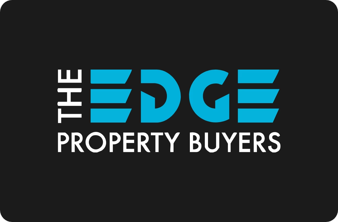
The old logo had been in place since the beginning of the project and was looking a little tired. There were some awkward gaps and the layout felt unbalanced.
The New Logo
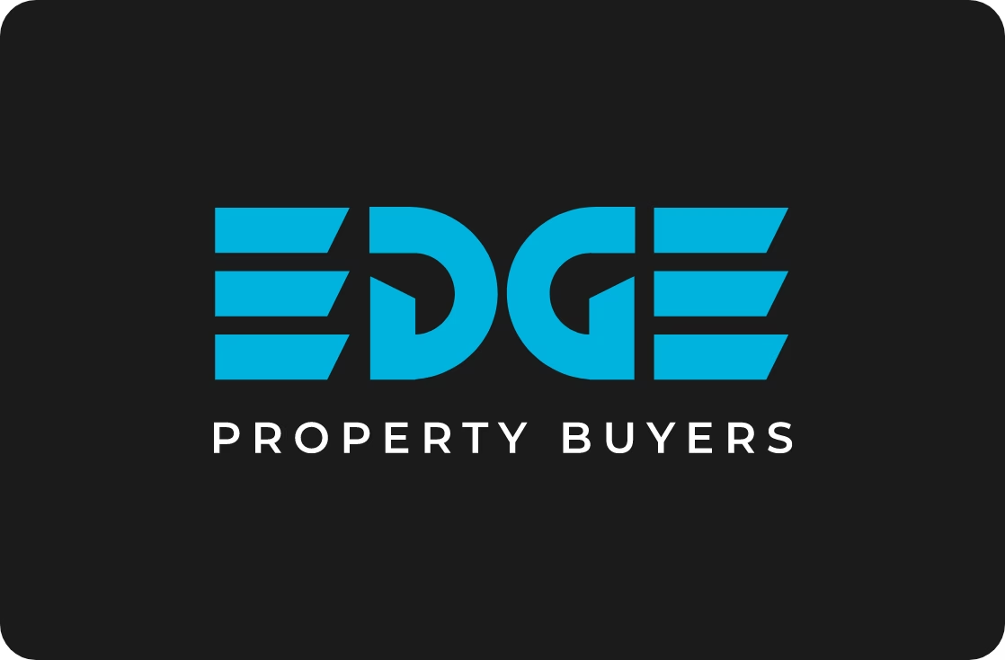
We refined and redrew the letterforms, simplifying the overall look and adding “Property Buyers” in the brand main font, Montserrat.
Redrawing the Shapes

We took the logo back to basics, creating a new grid to build the letters. One thing that immediately stood out was to mirror the new D shape to create the G – something that was missing from the original. I mean, it was almost there…!

The finished redrawn letterforms feel a lot more balanced and refined. We experimented with a “backwards” first E in order to make the logo palindromic, but this reduced the clarity of the overall word.
The New Website Designs
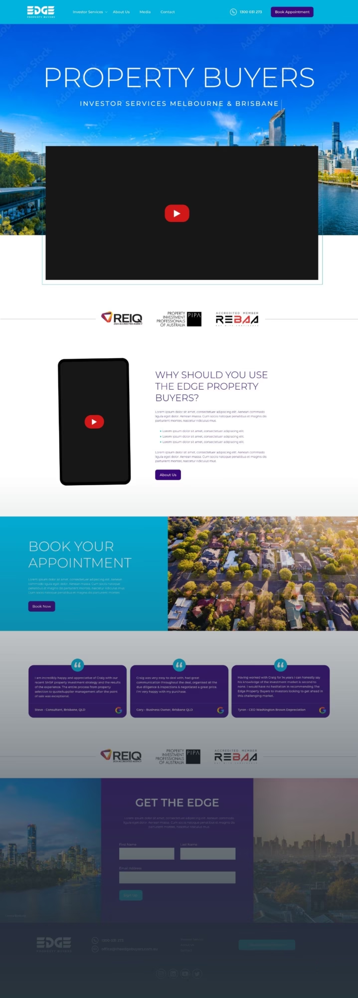
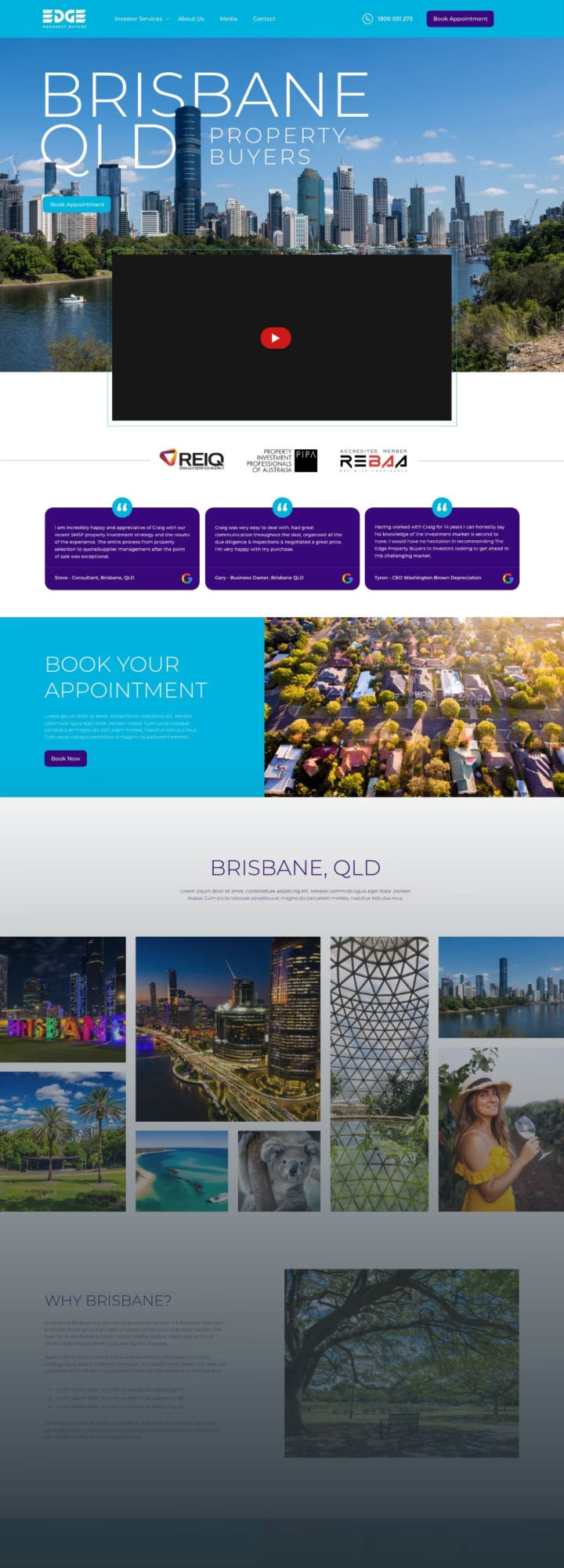
Our main consideration – ensure clear calls to action and put the video and embedded social content front and centre. We also wanted to make these layouts VERY visual, especially when it came to the Melbourne and Brisbane investor pages. We needed to showcase these beautiful cities to the uninitiated with plenty of large photos and explanation.
The end result was a big step up from the previous platform, presenting the brand in a slicker format and putting a mark in the sand for the future of Edge Buyers.
