Aurora New Dawn are a UK-based charity that focuses on supporting victims of domestic and sexual abuse, as well as stalking. The website is a vital touchpoint for victims who wish to seek help and requires a carefully considered user experience. Their old website was over a decade old when they decided that it was time for an upgrade.
Aurora New Dawn Website
The Brief
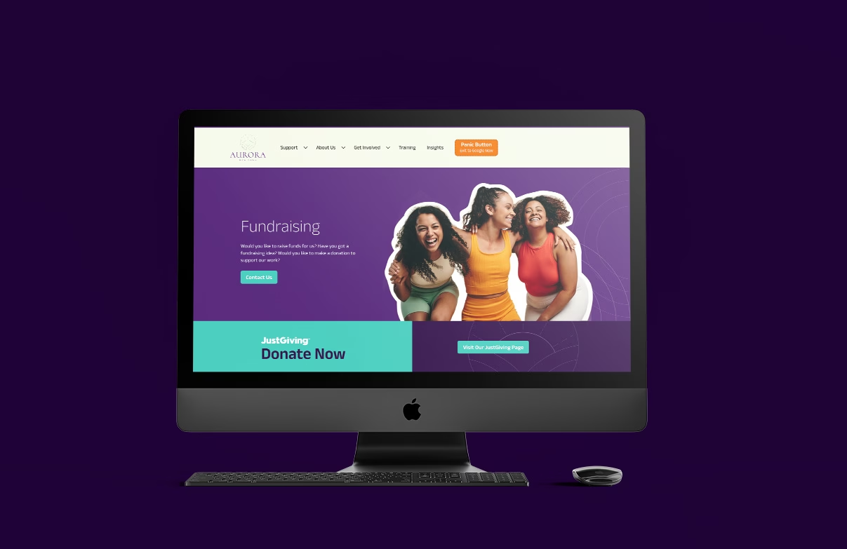
We’re looking to replace our old website, we need clearer information and the ability to fundraise through the site. The key thing for us is to ensure that information and advice is structured carefully and consistently for all users and victims especially to easily find answers to important questions.
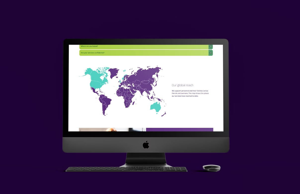
The challenge will be to ensure service-based information is easily accessible, but also make sure that donors, supporters, police, employers and training students can also access the correct content quickly and easily. We need to communicate the right message with the designs and imagery – it’s important that we keep things positive while reflecting on the serious nature of the content.
The Solution
The content for the previous site had grown gradually over the years as advice changed and new parts of the service grew. This has resulted in the site becoming cluttered and unwieldy; the backend editor didn’t allow the use of components to separate content and the priority, relevancy and usefulness of the content hadn’t been reviewed for a while.
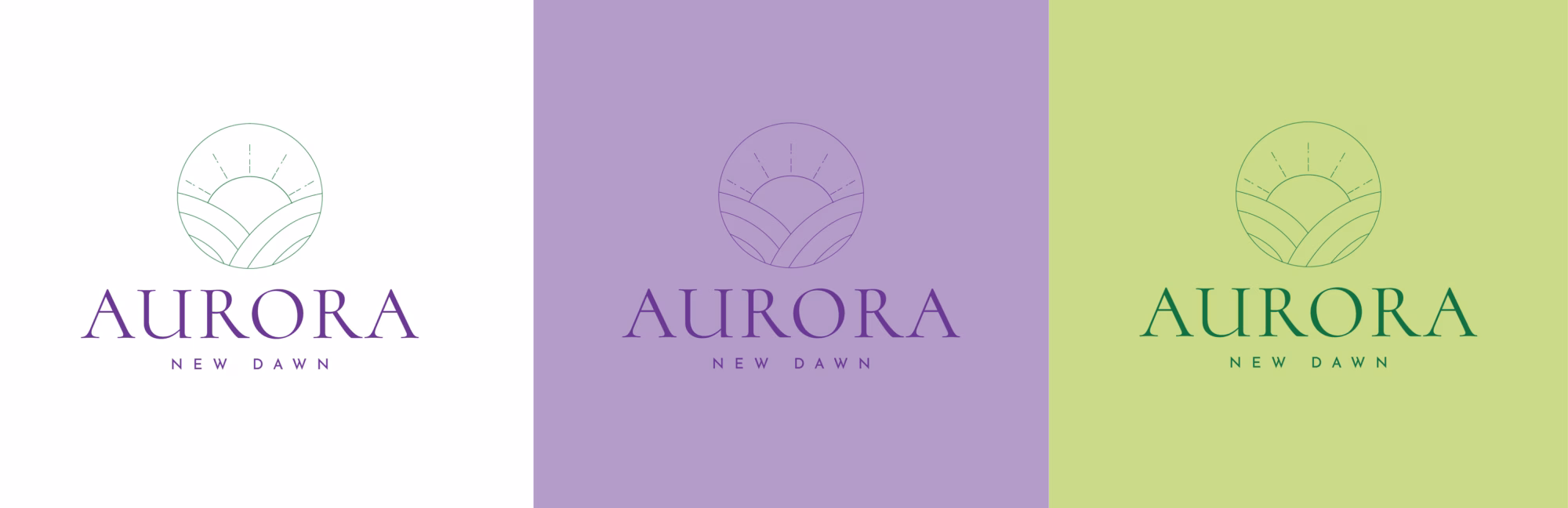
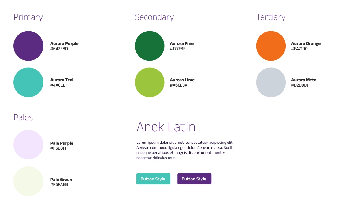
A new logo design was provided by the charity just before the project began – but with no brand guidelines we were working from a blank slate in terms of its application.
Building the Structure
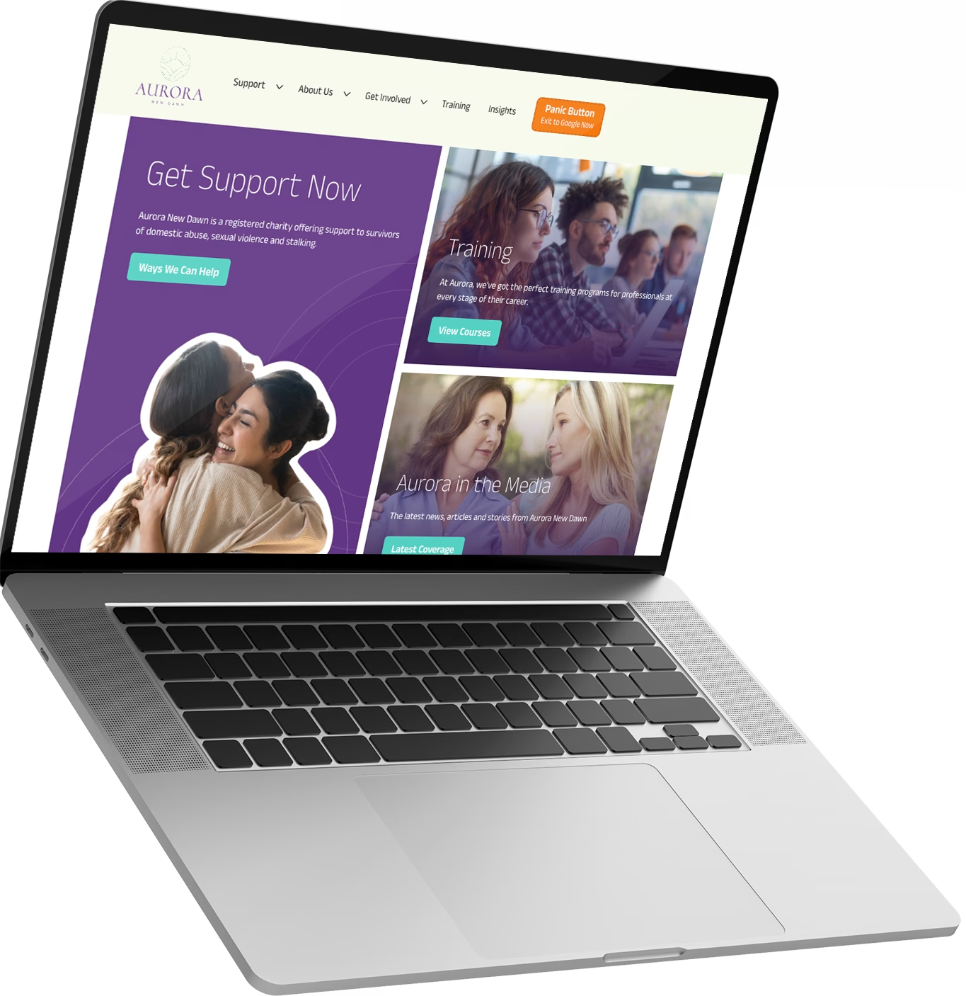
Over ten years the original site structure had been completely outgrown, some sections were simply huge blocks of text while other pages had been added without consideration of the users who need to find it. After a detailed analysis, we developed user stories for the main user types before creating a detailed new sitemap that grouped relevant info and restructured certain sections inline with user requirements.
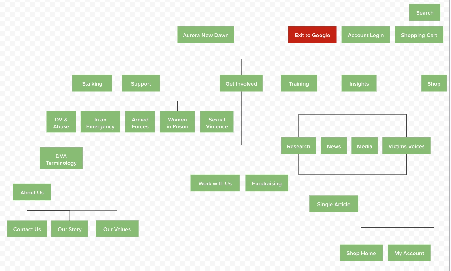
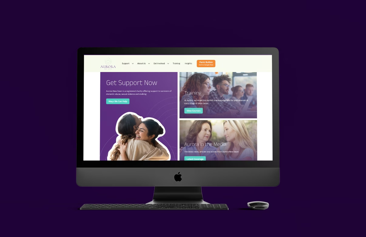
Clearly the most import user type were the victims trying to access support. Information on the various types of support available had to be clear, structured and easy to edit for the charity. Support access details had to be seen as a priority on all support related pages.
We also grouped together several article content pages together into a new Insights section, allowing items such as Victims Voice pieces to be read alongside news articles. This simplified the articles and allowed easier access through article categorisation.
The Design
We started by establishing the key parts of the new brand – colours and fonts. These are the simplest building blocks in the whole process.