We recently worked with ESDM Training to help them boost their training enrolment rates (see our case study) and as part of the solution, we decided to rename them Allies for Autism. This triggered a branding exercise to reposition the organisation and create something uniquely them.
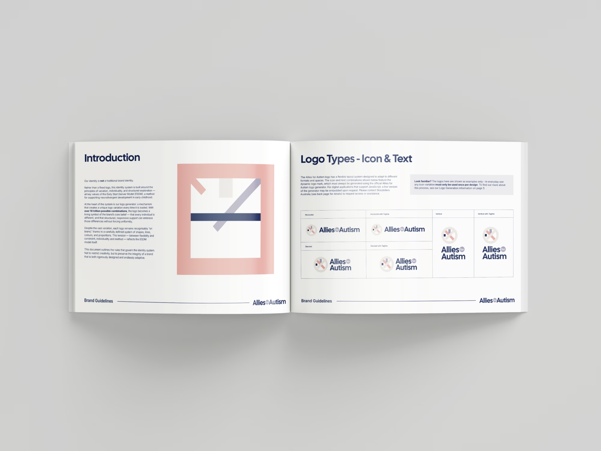
As we poured through our research, we realised that the approach to understanding autism is always based on the individual. There are plenty of common threads between people with the condition, but by its very nature it expresses uniquely in every case. A unique formula in every case. The power of the individual.
This started us on an idea – what if the branding was ALWAYS unique and each variation held significant value the one time it was used? What if the core branding and the layouts created from it were always crafted in individual ways?
The idea that a brand identity could embody individual uniqueness inspired us to see how far we could push it. Maybe if we developed a system that generated vast amounts of variations we could create a system where the logo was only ever used once. That makes every fleeting appearance all the more significant and special.
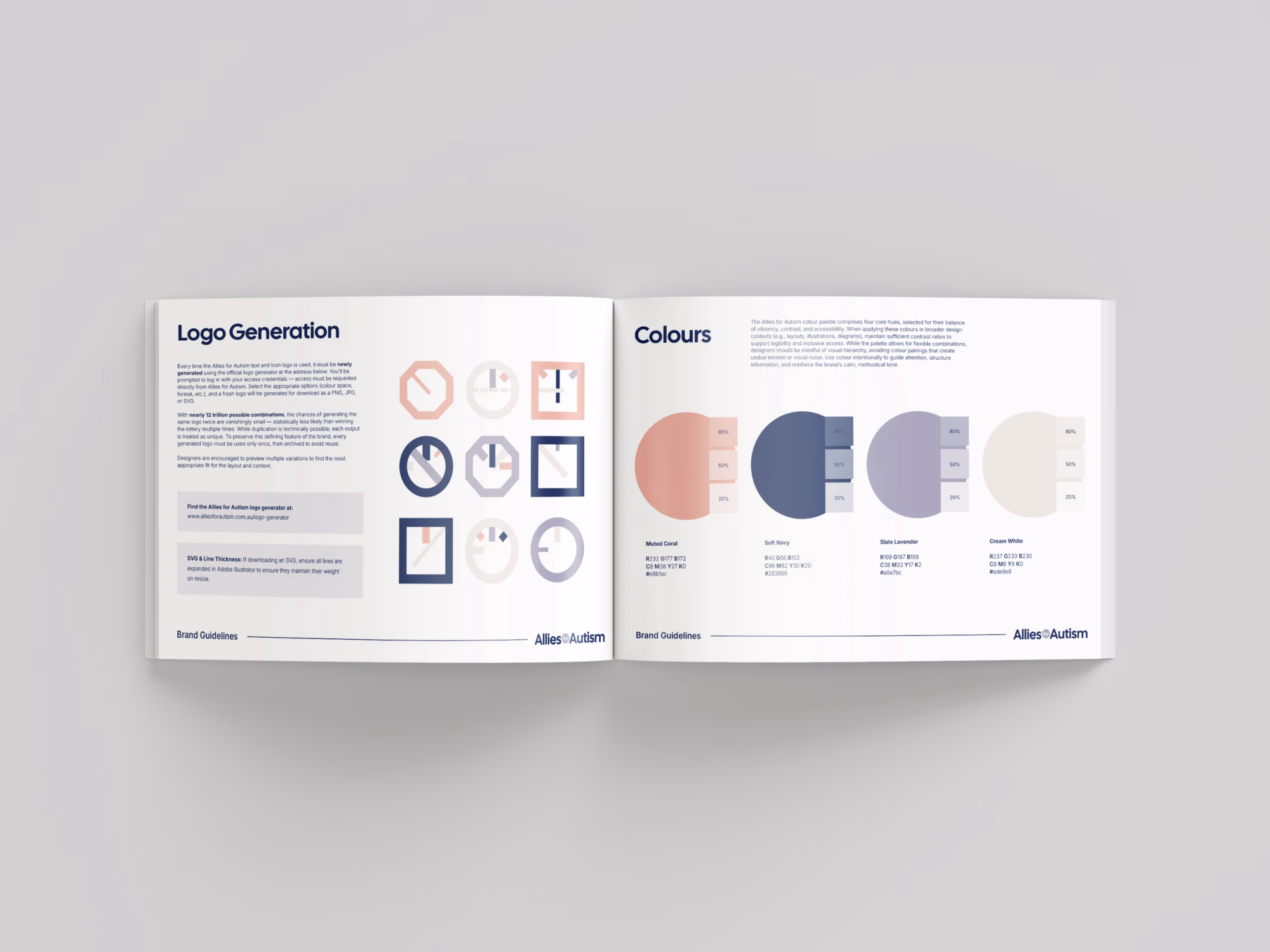
So I started to think of a basic framework that would have a recognisable structure but with enough variable elements that it would be extremely, extremely rare for the same logo to be used twice. Down the road we would also need to develop a logo generator to create new versions, so simplicity was key to ensure the development of such a tool would be relatively straightforward.
Building the Icon

It started as basic as you can imagine – we needed a selection of outer shapes for the icon. That would be an easy multiplier giving us 3 times the end variation total. The fact that it also sort of resembles a koala’s face is a happy accident!
The Inner Grid
To keep things simple, we kept the internal grid structured around diagonal and cardinal lines. This gave us a good deal of variations without too much hassle.


Line Weight & Colour
The internal lines were now given their own set of rules. They had the option of being 1 of 3 weights, with X being the width of the outer shell line and the other weights being held at 0.8X and 0.5X. These numbers roughly co-ordinate with the golden ratio.
At this point we introduced the colour palette created for the brand. The lines 1 -4 had to be different colours but the outer shell line could be any of the 4 even if it duplicated (which of course it often does).


Line Length
Each of the internal lines can be between 20% – 100% of the distance between the sides/corners giving 81 separate potential lengths (at 1% intervals) for each present line. This boosts the variation count significantly, going from a measly 488,160 variations to over 1 trillion.
This crossed us over the threshold we were looking for – a brand identity that used a fresh logo every single time. In fact at this stage, if you used one new logo a second it would still take you over 30,000 years to view each variation.

The Dashed and Special Variable
The final addition we made to the algorithm added a 1 in 20 chance of one of the lines being a dashed line. This could only happen to one of the lines in the internal arrangement at a time. This significantly raised our variation count but we wanted to add something really special.
Also, finally, we decided to add in something special that will rarely appear. There is a 1 in 1,000,000 chance that a star will appear in the centre of the logo. Eventually this special version of the logo will surface – if you see it appear on their website, let them know!


Completing the Logo
With the icon concept ready to go, we set about completing the logo with the typography and the various horizontal, stacked and vertical layout options.
The Results